How To Create A Good Pin?
March 17, 2021
Here Are The Ingredients For A Good Pin:
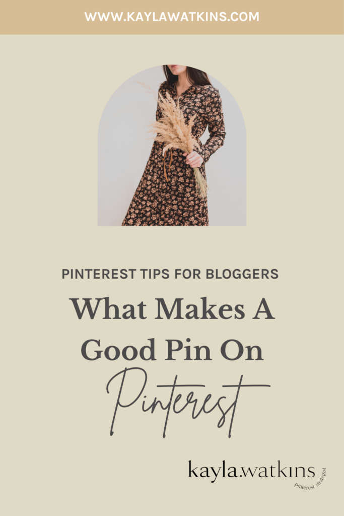
Here’s my go-to recipe to create a good pin that can help get more eyes on your content and website:
- An image that clearly showcases the topic
- Keywords
- URL
- Flat-lay Image
How To Use This Post:
- PIN 👏🏼 IT 👏🏼
- Go to your niche/niches and read carefully.
- See if there is something you already wrote about that you can bring new life and fresh pins to.
- Start brainstorming how you can have your own take on these categories and start planning to share.
- Get dem potentially viral pins out there
Pin This For Later:

Breakdown Of How To Actually Create A Good Pin:
An image that clearly showcases the topic: you want to get people who actually want info about that topic or product. Make sure the image isn’t too vague that it captures the attention of the wrong audience. You want people looking for invite tips to see an INVITE vs. just a bride.
Keywords: forever necessary so including relevant topics is a great way to get them in the graphic, BUT don’t do what I did and make it tiny calligraphy font- too hard to read on mobile (where most users pin from).

URL: don’t forget to include your URL- partially because we don’t want people to jack your graphics and partially because why not get that out there every chance you get!
Flat-lay image: good photography is key on this visual search engine, so make sure to use clear and pretty pics.
Follow @pinterestforbloggers on Instagram for more Pinterest Tips & Tricks.
What To Takeaway From This Blog Post:
- A good, clear image goes a long way on Pinterest!
- Keywords are your BFF when it comes to Pinterest graphics.
- URLs are a must on your pins.
[…] How To Create A Good Pin […]
[…] How To Create A Good Pin […]
[…] How To Create A Good Pin […]
[…] How To Create A Good Pin […]
[…] How To Create A Good Pin […]
[…] How To Create A Good Pin […]
[…] How To Create A Good Pin […]